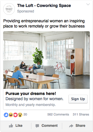
The Loft is a new female-only co-working space concept in the United States. Their mission is to provide entrepreneurial women an inspiring place to pursue their dreams while building a community. Their tagline is simple – “designed by women for women”. They will be taking the moodboard and brand design to help us visually design the interior aesthetic of the co-working space.
Their primary target audience is females in the U.S. between 23-40 years old who are either a remote worker, launching a start-up or passionately growing their own business. The ideal customer has an affinity for details, beautiful design and inspiring spaces. (They provide entrepreneurial women with monthly and yearly membership access to our co-working space: this includes weekly speakers and events, high-speed wifi, complimentary blow-dry bar, beauty essentials, on-site yoga classes, shared work spaces, Skype booths etc.)
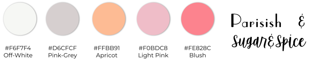
Insights: Blush as a palette color was a must; the others are combinations of pink, grey, and orange for a vibrant but female centric space. Sugar&Spice and Parisish would both be girly themed fonts – it’s best to have one cursive and one non-cursive font to complement each other. Based on what The Loft stands for, we would center the brand around 3 pillars: aesthetics and visuals; productivity and aspirations; amenities and networking. All content should lead back to these three pillars, whether it’s a podcast, a social media post, or sales material. It should all highlight the value proposition that “you aren’t getting this much value in one space anywhere else – a place that looks pretty and where you can hustle, connect, inspire, reset, and look pretty yourself”.
Branding Colors and Fonts:
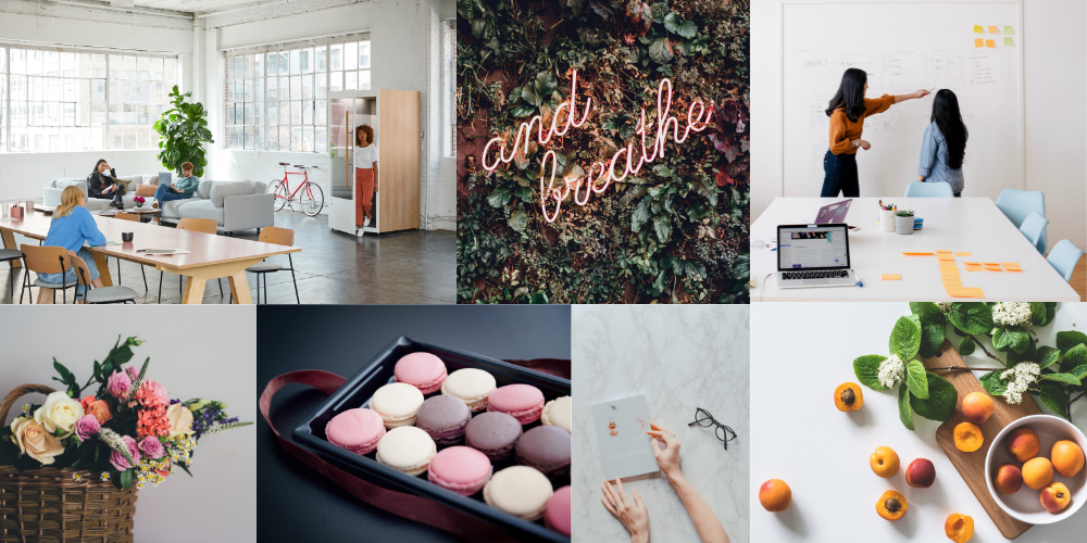
Moodboard Collage (design inspiration):
Keynote Presentation (for speakers & events): the-loft-coworking-keynote
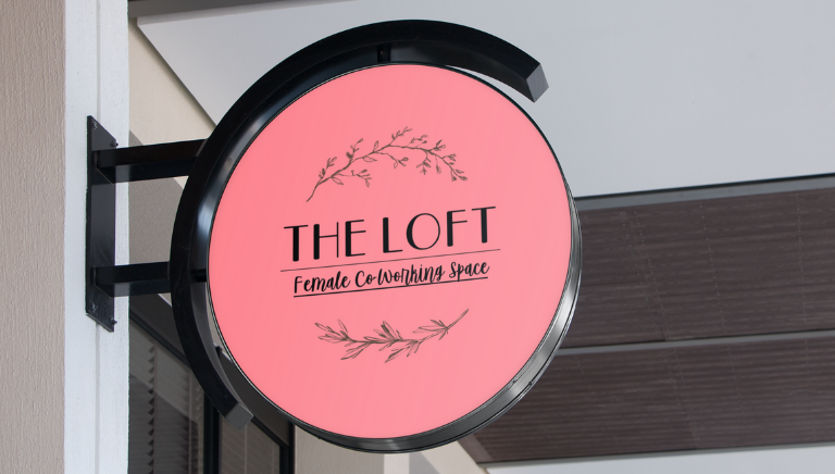
Sign Mockup:
Facebook Ad (awareness):